Updated: Category: Strategy
Welcome to the (almost!) final installment of this mini-series on effective technical presentations. This time I want to share how to overcome the second curse of speaking. And it has to do with keeping a rhythm.
If you missed the previous parts, I encourage you to go back and have a quick look:
- Part 1 – Ingredients: the ingredients you need to develop a credible and engaging presentation
- Part 2 – Mixing: the right proportions of ethos, logos, and pathos and how to adjust them
- Part 3 – Delivery: overcoming the first curse of speaking
- Part 4 – Multiplexing: how to transmit multiple signals to your audience
- Part 5 – Waveforms: how to shape your presentation’s emphasis
The Second Curse of Speaking
Having presented the first curse of speaking in an earlier episode, you might guess that there’s more than one curse. And you are correct:
The second curse of speaking: you know where you are headed but the audience has no idea.
This one is related to the broader curse of knowledge, which states that it’s difficult to imagine what learning (or listening) is like for people who are new to a topic (and might also explain a lot of confusing university lectures). As a speaker, you likely have a great idea of where you are headed and it all makes complete sense. However, your audience has only seen a fraction of the picture, leaving them with a tricky challenge:
Listening to a presentation can be like playing Pictionary: you see a few fragments and have to guess what overall picture the speaker is trying to convey.
And just like Pictionary, the author continues to be baffled why his team mates (or the audience) can’t name the right concept.
A Map is Only Useful If You Know Where You Want to Go
The most tempting solution to this dilemma is to start a presentation with a table of contents. “Tell’em what you’re gonna tell’em”, so the audience will know exactly where you are headed and won’t be lost along the way. Sadly, as already discussed, starting with a table of contents is a poor way to draw the audience in because it lacks both ethos and pathos. Worse yet, it also won’t help the audience much because, as a smart person once said, a map is only useful if you know where you want to go. It’s like finding out in your first math lesson that somewhere down the line you’ll study differential equations and Fourier transforms. OK, if you say so… I’ll suppress my unbearable excitement until then!
Because the audience doesn’t yet know where they want to go a table of contents as a map is rather useless.
Another technique is to use some form of breadcrumbs or vignettes. Those are a bit better (they are easy to ignore) but still feel like crutches. You never see a movie telling you that you’re in section two point three with the battle for the Death Star not coming up until three point one.
Anticipation with Mental Models
Apparently as presenters we have a usability problem. The problem is biggest for technical presentations. After all, most TED talks rather predictably start with a personal story and end with one great piece of advice based on that sole data point. However, that is not so clear when you are arguing why declarative infrastructure automation doesn’t preclude you from using a procedural language from describing it (hello, CDK and Pulumi!).
When suffering from usability problems, one should visit the UX doctor. User experience designers have seen the problem umpteen times: no one reads the manual and dives into software without any idea of how it works. The prevalent answer is to allow the user to build a mental model of the software based on what they have done and seen so far. For example, a user might have learned that an underline in text indicates a hyperlink or that they will be prompted before performing any action that can’t be undone. Although a mental model can’t be directly programmed into the user’s head, consistent design goes a long way towards allowing the user to build a model that matches the software’s internal model.
What does a mental model look like for a presentation? Somewhat simplified it comes down to two factors:
- Consistent use of visuals. For example, a quote page might always have a photo of the originator, allowing the user to apply this mental model for subsequent slides. Or an empty right half of a slide might mean that a counterpoint is coming (actually, one of my favorites).
- A consistent rhythm that tells the user what comes next.
There’s tons of material about consistent visuals, so I’ll skip this aspect here besides just pointing out that they achieve two major effects:
 Reducing cognitive load: same things look same and different looking things mean something different.
Anticipation: allowing users to anticipate what comes next, which isn’t just one of our favorite emotions but also one of the 12 basic principles of animation– you know that gravity will get Wile E. Coyote just a fraction of the second before he goes down.
So, let’s dive deeper into using rhythm.
Time is Asymmetric–Keep it Brief
In the previous post I shared presentation waveforms, such as the Pulse or the Sawtooth. All these waveforms repeated with their respective frequency, allowing the audience to anticipate. For example, if you are using the pulse waveform and haven’t injected an example or metaphor in a while, the audience will expect one to come soon. So, they know here you’re headed.
When preparing a presentation, most speakers feel that there’s too little time. I was once asked to speak about cloud and transformation for 12 minutes—I feared that I might not be able to say much at all! As a side note, recording talks due to lockdowns has given me a better sense of timing as I find myself speaking at about 100-120 words per minute. Carefully selecting words and sentences does allow you to get a lot across in a short amount of time, as I was surprised to see myself in my 23 minute talk on Cloud Strategy.
Still, most presenters have a difficult time getting their content into even 45 minutes. However, paying close attention while listening to someone makes 45 minutes close to an eternity! That’s the asymmetry of time when you’re presenting.
Pro tip: keep virtual presentations to 20 minutes or less; people will tune out faster without the stage, a whiteboard, or an audience in the room.
The best way to keep people’s attention over the whole stretch of a presentation is to break it into shorter segments. Now many speakers divide their presentation into “section 1”, “section 2”, etc. but that won’t help much to beat the second curse of speaking. People will figure on their own that you’re halfway through by looking at their watch, and being in section 2 of 4 doesn’t really achieve much more.
The Solution: Build a Rhythm
A much better way to break down a talk is to divide it into a regular rhythm. A rhythm is a repeating sequence of slide types (or aspects), each of which covers one topic:
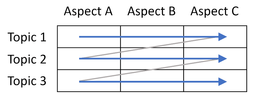
For structural thinkers (hi, architects!), it’s a layer-by-layer traversal through a topic matrix formed by topics on the vertical axis and aspect or type of slide on the horizontal axis.
A simple example is to break down a topic into subtopics and then cover each subtopic with the same sequence of slide archetypes. When presenting products, a short rhythm that I frequently use a lot consists of 4 slides:
- Principle–what is it?
- Benefit–why is it useful?
- Product–how can you get it?
- Case Study–does it work?
The rhythm would repeat the 4 elements for each product (or segment) in your portfolio. For example, to stay with the slightly cheeky example from above, if you are in the cloud automation space, you might explain why infrastructure automation is a critical element of cloud computing, the benefits it provides (hint: it’s not (just) about efficiency), share your respective product name and features, and follow up with a concrete customer example. The same sequence would repeat for your IoT product, analytics product, or what else you have in the portfolio.
A rhythm not only gives the audience a hint about where they are but also about what comes next.
The great thing about a rhythm is that it guides your audience. For example, if part of your audience finds the principles too conceptual, after the first sequence they’ll know that you’ll present the tangible benefits next and will be more patient. Likewise, some people will eagerly wait for the next customer case study whereas others will get more out of the next “principles” section. You are multiplexing now across the different facets of your topic and keep a more diverse audience engaged.
Your rhythm lets the audience anticipate what’s next without you ever handing them a table of contents. That’s because they build this mental model in their head on their own. Some might not even explicitly notice the rhythm, but simply enjoy your insightful and fast-paced talk. It’s like listening to music: some listeners will pay close attention to the rhythm while others just find it “relaxing” or “sounding nice”.
Sequencing
Two questions invariably arise when I share the concept of a presentation rhythm:
- What’s the right rhythm?
- What’s the right sequence of topics to apply the rhythm to?
As this post is getting longer than anticipated (this mini-series is the dry-run for my some-day-to-be-written book, I’ll answer briefly:
The Right Rhythm
I suggest to not reinvent the wheel and pick from one of a few simple rhythms. The one above actually works well for most products. Another good one that packs more pathos is:
- Quote: get attention, pack pathos
- Architecture: define the space in which you will make your key statement (that’s logos, and can build a bit of tension as you highlight the problem that you will solve)
- Product/Solution: a mix of logos and pathos (your product helps customers solve the problem)
- Customer Reference: that’s your ethos, your credibility
The Right Sequence
My go-to text here remains Barbara Minto’s Pyramid Principle. The sequence of topics should be ordered chronologically (you can follow a signal from your IoT sensor to your data stream to your fancy analytics and end user dashboards), by dependency (servers and VMs, then containers, and last serverless), or by complexity (starting with a simple example that you expand). The important par is that you consciously selected an order.
You will see how good your sequencing is by how well your transitions work. If your transition falls back to “another important topic is…” then your sequence isn’t working.
If your transition falls back to “another important topic is…” then your sequence isn’t working.
Zooming Out–Literally
You might recall that architects like to zoom out, so this time I encourage you to literally zoom out, in your slide tool, that is. A great way to design the rhythm in your slide tool (or in your sketchbook) is to zoom out the slide sorter so that you can see the grid in front of you.
The following is a real (slightly sanitized) presentation that I gave to a major corporation’s board of directors:
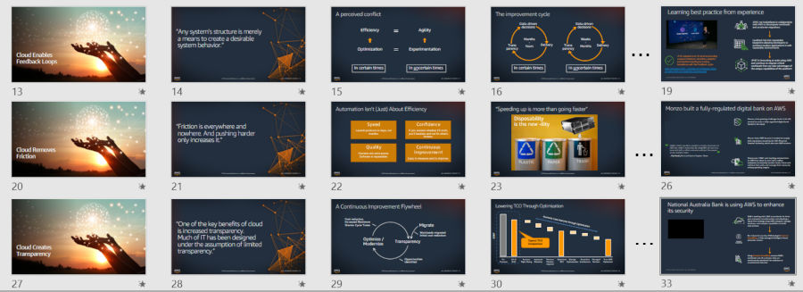
I am making three key statements about the ways in which cloud transforms your business:
- Cloud enables feedback loops
- Cloud removes friction
- Cloud creates transparency
Each section follows the same rhythm of a divider slide (anticipation - think Wile E. Coyote), opening quote (getting attention, pathos), mental models (lots of logos, but refreshingly different from many presentations that top execs get to see), and a customer reference (ethos).
And that leaves us with just a final metaphor for making complex technical topics stick.
This blog series is a test run for a possible book Presenting Like an Architect. If you enjoy this content, please register your interest on leanpub or share the blog with your social media network.
Grow Your Impact as an Architect
The Software Architect Elevator helps architects and IT professionals to take their role to the next level. By sharing the real-life journey of a chief architect, it shows how to influence organizations at the intersection of business and technology. Buy it on Amazon US, Amazon UK, Amazon Europe