Updated: Category: Strategy
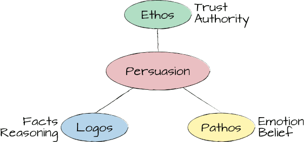
Part 1 of this mini-series described how a good presentation should combine actual experience, mental models, and a punch line, realizing that this model closely maps to Aristotle’s Modes of Persuasion from some 2300 years ago:
- Ethos: Credibility or authority of the presenter (literally meaning “character”)
- Logos: Reasoning and logical appeal
- Pathos: An appeal to the audience’s emotions (“empathy” is a related term that helps memorizing this one)
Experience adds to ethos because it gives you credibility, mental models use logos to show the audience how pieces relate to each other (one could say, this is “architecture”), and a memorable punch line can stir emotions, such as surprise or humor. Having been around some 2300 years, Aristotle’s model is widely cited and shared, including in my own book.
Ingredients Alone Don’t Make a Cake
To make these elements fruitful in a presentation, they need to be strung together into a flow. Here we encounter the limitations of a simple model like this one that’s included in The Software Architect Elevator in the chapter about Showing Pirate Ships (to figure that one out, you’ll have to go and read the book):
This picture is a prototypical model (by now you surely know that I like models): it breaks down a complex topic into its components, abstracting away noise and highlighting the important aspects. One could even say it’s the architecture of a good speech—at least it passes the test of having lines.
However, the model is missing some important aspects. It’s like a recipe that shows us the ingredients but it doesn’t tell much how much of each ingredient we need and how we put them together. It’ll be rather difficult to bake a tasty cake based on a list of ingredients alone (insert my pet peeve about “my architecture is product X and product Y” right here).
Upping ethos and pathos from the typical 2% (allocating 96% to logos) to about 20% makes a world of difference for technical presentations.
Let’s start with the percentage of ingredients (I’ll leave the putting together for Part 3). The typical technical presentation tends to consist of 96% logos, leaving perhaps 2% each for ethos and pathos, leaving a lot of improvement to balance things out. Shifting things to perhaps 60% logos and 20% ethos and pathos each will make a world of difference. After all, we are still talking about complex technical topics, but we shouldn’t make it a purely technical talk.

At the same time, technical presentations needn’t be 1/3 each or flip completely the other way, like many Ted talks do. You might be making your IT great again but your audience is likely to want to hear some logos on how exactly that’s going to work.
Going to Extremes
Injecting more logos and pathos into technical presentations has been one of my favorite exercises in my live workshops (I don’t offer them at the moment). To highlight the power of ethos, logos, and pathos, I presented the same argument in three short speeches that turn each dial to “10”, respectively.
Let’s assume your job is to convince people that moving faster is the essential element of your organization’s digital transformation (I do like very realistic examples). Here are three ways to go about this:
-
“The digital world charts new territory with new business models and new ways of interacting with customers. Such novel techniques have to be tested via experiments. Now, it doesn’t do much good if each experiment takes 18 months, therefore moving fast is the most essential property for organizations that are successful in economies of speed.”
-
“We often debate how we can better compete with so-called digital disruptors. Well, after spending over a decade working as a software engineer in Silicon Valley, I point to one fundamental advantage those companies have: they are simply moving faster.”
-
“Our company just posted another record quarter. So did Kodak, a few quarters before they went bankrupt. They were simply not moving fast enough. But we don’t have to make the same mistake.”
As you likely guessed correctly, the first snippet is 90% logos (“from A follows B follows C”), the second one 90% ethos (“I was there and am here to tell you”), and version three is pure pathos (“hey, we’re doing great! No, actually we’re doomed. But there’s hope…”).
Going to extremes (bonus points for anyone who was thinking of Kaleidoscope by Paul van Dyk with vocals by Jan Johnston) demonstrates that the three elements aren’t just minor variations, but result in completely different speeches. That’s the magic of ethos, logos, and pathos. Digital transformations are the perfect place for such mixes as they are at the intersection of technology and organizational changes.
Ethos, logos, and pathos aren’t just minor variations but result in completely different speeches.
Amplifying Ethos and Pathos
After understanding the potential of ethos and pathos, it’s useful to know some handy techniques to increase their share in your presentations. It’s like putting more butter and sugar into your cake or your cookies: they can only get better!
The big difference between ethos and pathos is that ethos about you, whereas pathos is mostly about the audience. Let’s start close to home:
More Ethos
A little ethos goes a long way. It helps overcome the initial hurdle that any presentation must take: convince the audience that listening to you is more valuable than checking email or browsing the web.
Ethos helps overcome the initial hurdle that any presentation must take: convince the audience that listening to you is more valuable than checking email or browsing the web.
- Experience: We saw already in part 1 that experience builds ethos. Sharing your experience from a concrete project leaves a stronger impression than an abstract framework.
- Affiliation: Related, your affiliation (along with titles or degrees) can also impact your ethos. Before you add “ex-Google, ex-ThoughtWorks” to your LinkedIn tag line, remember that this can go both ways–you wouldn’t write “failed at most big tech companies” either, so it’s all about the dosage (yes, Mr./Mrs. “PMP, PRINCE, CCP, MCTS, MIA”, I am looking at you).
- References: The experience doesn’t always have to be yours–you can also cite external, credible sources. If Martin Fowler / Gartner / Jeff Bezos said it, it must be (mostly) true!
- Appearance: We shouldn’t base technical credibility on appearance alone but your audience is pre-programmed to form judgment base on your looks and outfit. If you don’t like it, you might need to have a word with the ultimate chief architect, or just accept it. For example, who would want to question Grady Booch’s credibility about architecture?
- Speech Patterns: Some have observed my annoyance with the fact that deep voices make speakers more credible. Not only does it amplify gender bias, but I also end up listening to deep, slow voices far too often. But before you get the vocoder out, there are more subtle ways to boost a bit of ethos. For example, slowing down your pace, pausing, or varying your vocal patterns can also make you appear more authoritative.
More Pathos
Pathos is about your audience: many speakers are very excited about their topic but the audience isn’t. That’s not pathos, but pathetic. First, I tend to remind technical speakers of the breadth of emotions that we can feel, in case one or two became forgotten while typing code into a text editor all day. A nice way to illustrate emotions is Plutchik’s Wheel of Emotions:

In my little speech above I used at least four emotions:
- I began with pride and optimism
- Next, I gave the audience a surprise
- Then I triggered fear
- I conclude with hope and anticipation
Not all pathos relies on strong, one-dimensional emotions like these. There are many simple techniques to “liven up” technical presentations:
- Stories and Anecdotes: stories used to be the way knowledge was passed for millennia, so humans are well attuned to listening to stories. Watch people cry when watching a move - that’s the power of pathos. Again, success lies in the balance - some people feel that they need to package their technical content into a long heart-wrenching story. That’ll surely miss many people’s (surely mine!) marks. So think about short anecdotes more than long-winded stories. You don’t want your core messages gone with the wind…
- Analogies and Metaphors: Analogies allow you to relate your mental models (logos!) to something the audience is already familiar with and often has positive associations with (pathos!). One of my favorite examples is a short speech by the late Russ Ackoff on continual improvement. Almost each statement he makes about complex systems is related back to the automobile (4:12) or the human body (4:34) - notice the audience’s emotion as they are listening to an academic talk about complex systems theory.
- Concrete Figures: Even little things like replacing words like “big”, “sizable”, or “many” with concrete figures can make a presentation more relatable. So, next time you talk about scalability, reference the customer who had “thousands” of microservices and had to manage “several hundred” custom VMs.
- Punch Lines: We saw in Part 1 that short, memorable punchlines or slogans can also stir emotions, and such boost pathos. “Don’t run software you didn’t build” is more pathos than “a modern enterprise prefers a SaaS model of cloud computing for COTS applications”.
The Right Kind of Pathos
Not all emotions are positive, though. Remember Plutchik’s wheel: there you’ll find contempt, loathing, rage, and sadness. That’s not the kind of pathos you’re going to want to inject into your audience. Therefore, here a (likely incomplete) list of techniques that avoid some of the biggest emotional pitfalls in technical presentations:
- Arrogance: Most people listen to you because you can tell them that they don’t know yet or are unsure about. So you really don’t need to point this fact out. I once attended a vendor’s executive briefing (the advantage of having spent time on the customer side) that felt like a lecture–we were not impressed.
- Intimidation: Closely related, a lot of listeners are intimidated by all the technical terms and acronyms in technical presentations. A very simple technique can do miracles here: instead of just starting off with “container orchestration”, you first explain what it is in simple terms and then follow that with “and that’s what’s often referred to as ‘container orchestration’”. Your audience now knows that they aren’t expected to know the term and have some idea what it actually means.
- Confusion: People might like what you tell them but have little idea how it all fits together or what they should do now, leading to a wasted opportunity. So, make sure to relate conceptual content back into easy 1-2-3 steps of action.
- Fear: When I teach pathos to techies, the first emotion that invariably comes to their mind is fear. “If we don’t pay down our technical debt / keep under-investing in security / postpone the cloud migration…” seems to be the one way we know to “motivate” our audience. Some amount of fear can be helpful to grab people’s attention (interest, benefit, fear are often cited as the main motivators for the audience to listen to a talk), but I’d rather place it on the “do less of” list.
Now that we know the ingredients and the proportions, all that is left is knowing the sequence of how to put them together. That’ll be Part 3. Stay tuned (anticipation!).
Grow Your Impact as an Architect

The Software Architect Elevator helps architects and IT professionals to take their role to the next level. By sharing the real-life journey of a chief architect, it shows how to influence organizations at the intersection of business and technology. Buy it on Amazon US, Amazon UK, Amazon Europe