Updated: Category: Strategy
After explaining the ingredients of a good technical presentation in Part 1 and their proportions in Part 2 of this mini-series, let’s talk about how to actually string ethos, logos, and pathos together so that they flow smoothly, keep the audience engaged, and get your technical message across. This is where the rubber meets the road as you have to overcome the first curse of speaking:
The first curse of speaking: Hardly any idea worth sharing is linear. But language (both written and spoken) forces us to structure it that way.
So, we’re stuck with packaging all the great ideas we have, alongside with logos, ethos, and a healthy dose of pathos into a linear sequence of words. Perhaps slides can help here because they allow us to show complex relationships in a two-dimensional image. However, the slides still have to go along with a linear narrative, so we’re not home free.
A lot can and has been said about structuring a good technical presentation. I am actually aiming to capture my thoughts into a mini-book at some point. So let me share just a few key lessons here, perhaps as a pressure relief for my brain and a teaser for the yet-to-be-written book.
Anti-Pattern #1: Telling it like it happened
Let’s start with the most common mistake for technical presentations, right after looking at your shoes instead of the audience (or the camera in 2020/21). Your content likely required a significant amount of mental effort to develop. So your initial temptation is likely to tell the audience that story - from the beginning. First, it’ll make for a logical flow and your audience will also be more inclined to appreciate the effort that went into the results.
The sad truth is that the audience isn’t much interested in all the background work but rather in the findings. That’s why impactful presentations start with the results and then back them up with data. Essentially, you are presenting in reverse. So instead of starting with “We evaluated over a dozen run-time infrastructure frameworks, examining each in the context of our critical applications, held a half-day workshop with each vendor, yadda yadda” you should start with “Serverless run-times are the best fit for our application portfolio” (replace the conclusion with your preference - this is just an example).
Tip: Present in reverse - start with the conclusion and then back it up.
The urge to start with the beginning is so widespread that it’s listed as one of the top three structural mistakes in Emma Ledden’s Presentation Book. She refers to it as “Back to the Future”: don’t travel back into the past; instead, tell your audience where they’re headed.
Presentation Permutations
Let’s come back to our speaking recipe’s main ingredients – ethos, logos, and pathos. In order to fit them into a speech, we need to order them sequentially. So, what’s the right order? Sporting a math education, most architects will quickly conclude that there are 6 possible orderings (permutations) of 3 distinct elements:
- logos, ethos, pathos
- logos, pathos, ethos
- ethos, logos, pathos
- ethos, pathos, logos
- pathos, logos, ethos
- pathos, ethos, logos
The simplifying assumption here is that you are limited to one segment of each ingredient without repetition. Let’s stick with this assumption for a little bit as this somewhat artificial constraint amplifies our choices. Once again we’re going to extremes. No worries, later on we will allow mixing and matching.
As you will have likely guessed, starting with logos is going to be tough. You need something to hook your audience. You can do that in two ways, depending on what the audience came for. Most of your audience will be listening because they are interested in what you have to say or they believe they can benefit from what you will tell them. Therefore, it’s good to confirm to them very early in your presentation that they did come to the right place. You are very unlikely to accomplish that with logos, so #1 and #2 are pretty much ruled out. Ending on logos is also unlikely to leave your audience with a strong call to action, which also rules out #4 and #6, leaving us with #3 or #5 as our main patterns. So, it’s a ethos/pathos sandwich with logos in the middle.
The Hook: Parachuting In
Many resources on speaking advise you that you have 45 seconds to draw your audience in, meaning you have to confirm to them that listening to you is more valuable than checking e-mail / browsing the web / thinking of what to cook for dinner. You could argue whether it’s exactly 45 but that’s besides the point. You might be able to stretch it to 60 but you’ll already be on thin ice.
The Ethos Hook
A lot of social media and adverts use the author’s credibility as the hook. Whether it’s the guy who left his $500k job to work for himself or the former CIO hostage negotiator telling you that crossing the street is a negotiation, ethos seems to me the most click-baity way to go (you’ll find them easily with your favorite search engine).
While that might be a bit much ethos for the average architect (your bait is the logos), briefly reminding your audience why it’s you who’s presenting can work quite well, especially if it’s coupled with your core message:
- “Over three decades as an architect, I’ve lived through half a dozen major architecture changes: from host and terminal to client-server to service-oriented architectures, the web, and microservices. And I can say with conviction that the shift to serverless computing is the most profound of all.” (sticking with our arbitrary example)
- “Some people say that everything in IT comes back after a while. I’ve been around IT long enough to have seen things the second or third time around.”
- “After studying over a dozen analyst reports on the latest tech trends, I have come to conclude that the following three are most relevant for us:”
All three examples build on your standing and experience but do so in what I would consider a meaningful and tasteful manner. Part 2 includes a handy list of ways you can build ethos. You notice that most of them also have a dosage of pathos, looking to evoke an emotion.
Neither example starts with “My name is XYZ and I have been in IT for 25 years”. I always wonder whether doing something poorly for a long time makes you more qualified or even poorer at it, so I am not a fan of these.
The Pathos Hook
Emotion also works well as an opener. Especially surprise and anticipation draw an audience in - they heard something they didn’t expect or something that makes them curious. Both are likely to leave them wanting for more, just like a movie trailer. Strong statements like we saw them in Part 2 usually pack a good dosage of pathos:
- “Everyone is talking about serverless computing. Alas, it’s going to be the least impactful technology for us” - now you owe me an explanation.
- “Enterprise architecture really is more common sense than anything else. Let me explain why.” - I thought it’s much more than that, but I am curious to hear your line of reasoning.
- “The biggest benefit of cloud computing isn’t an instant reduction in cost but an increase in transparency.” - Interesting way of putting it. I am curious.
Most of these examples play off anticipation and surprise. We learned that our repertoire of emotions is much broader than just these two, but as emotion doesn’t tend to be one of architects’ particular strengths, there is no shame in following a proven recipe.
Humor is another emotion that is occasionally used as an opener. I’d personally caution against it – not because I don’t like a good joke, but because at this point in the presentation you haven’t yet built enough rapport with your audience. They’ll have no idea that you are trying to be funny and might completely misunderstand you. “Cloud computing is really much ado about nothing, right? Just kidding…” might work for stand-up comedy where the audience expects humor but not for an executive audience that just signed a $10m cloud deal.
I have sat through numerous presentations that show a video clip near or at the beginning to evoke emotion: there’s a tree blocking a road and no one does anything unless a little boy starts pushing it, obviously in vain. Soon everyone chips in and we learn that together we are stronger and can remove any obstacles. I advice against such video content - people came to listen to you, not watch a movie. If you go for it, make sure it is short - 60 seconds won’t seem long to you, but it can exhaust the entire attention span of your audience. For reference, The Tree, while a very nicely done video with a good message, clocks in at 2:31. It’s best to watch it at another occasion.
Table of Contents? That’s Logos!
Some presentations start with a slide showing an outline or a table of contents. I have even seen slide templates requiring this. Such a slide has no place in a presentation, for two reasons:
- A table of contents is logos, not ethos or pathos. That’s not a good way to start.
- A table of contents is meant to help the audience navigate a book or an article, perhaps to jump to chapter 4. For a presentation, this option isn’t available.
So, give your audience something more engaging than a list of topics right at the start.
The Introduction is #0 or #2
When we mentioned ethos as a hook above, I didn’t refer to a formal introduction. An introduction is a big part of establishing ethos but it’s also a somewhat anticlimatic way to begin a presentation if it stretches beyond the single-sentence examples listed above. So where do you tell your audience about all the great things that you have done and all the great books you have written?
I prefer being introduced as a speaker so I don’t need to juggle my introduction with the flow of energy during the first few minutes of the presentation. You will notice that very few TED speakers will start by introducing themselves.
If being introduced isn’t feasible or practical, I tend to start with some pathos, e.g. a strong opening statement or metaphor, and then introduce myself. This order allows you to start with an attention grabber or something impactful. You might think it’s odd to introduce yourself on slide 2 but that’s totally OK if the opener is short - 45 seconds is a good benchmark.
As always, the best order depends on the setting. For example, I might start with a more formal self-introduction if I am speaking to a small and very senior audience as is the case in an executive briefing. This is one reason that I tend to ask organizers many questions about the size of the audience, where in the program my talk will fall, whether there’s an MC, etc. It never hurts to have more information about what’s on the audience’s mind when you start speaking.
It’s not Totally Linear
The simplifying assumption in this post was that the presentation is linear–after all that’s the first curse. Let’s loosen that one up a bit in the next post.
If you find these posts useful, allow me to point you to my book The Software Architect Elevator, which dedicates eight chapters to technical communication.
Grow Your Impact as an Architect
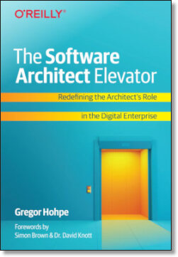
The Software Architect Elevator helps architects and IT professionals to take their role to the next level. By sharing the real-life journey of a chief architect, it shows how to influence organizations at the intersection of business and technology. Buy it on Amazon US, Amazon UK, Amazon Europe