Updated: Category: Strategy
The previous post in this series described how you can multiplex ethos, logos, and pathos into a single-threaded presentation. Let’s dig a little deeper and visualize how you can modulate our talks. Interestingly we will end up with oscilloscopes and waveforms–after all, we’re engineers.
Presentation Sparklines
Nancy Duarte and her team are often considered the grandmasters of effective executive communication. Correspondignly, her books adorn many architects’ bookshelves, including mine. A key feature of the book Resonate is the use of so-called Sparklines to show the rhythm of a speech. The term was coined by Ed Tufte to describe any kind of mini-chart embedded in a line of text, so this use is just a special case of a common approach.
Focusing on effective storytelling, Duarte’s Sparklines show how a speaker’s storyline oscillates between “what is” (now) and “what could be” (the speaker’s proposal of a better world):

Visualizing the transitions between the current world and the proposed one allows you to see how the speaker keeps the audience’s attention but also how they gradually shift the emphasis from one to the other. In the example above they start with the current world and end up with the future world as you’d expect, with several contrasts in the middle.
Presentation Architecture: Sparklines 2.0
While the Resonate Sparklines work well for “big” speeches, let’s admit that most of us architects aren’t MLK, JFK, Jawaharlal Nehru, or even Steve Jobs. And although we are looking to make the world of IT a little better with our proposals, we aren’t exactly out to change the world.
For technical presentations, I therefore find it more valuable to apply the concept of presentation Sparklines in the context of our favorite ethos-logos-pathos lens. You might call those Sparklines 2.0. They depict the architecture of a presentation that an architect or IT decision make might give.
Let’s test this on Russ Ackoff’s presentation on systemic improvements that the previous post discussed in some detail (if you haven’t done so, please take a look). We might end up with a representation like this:
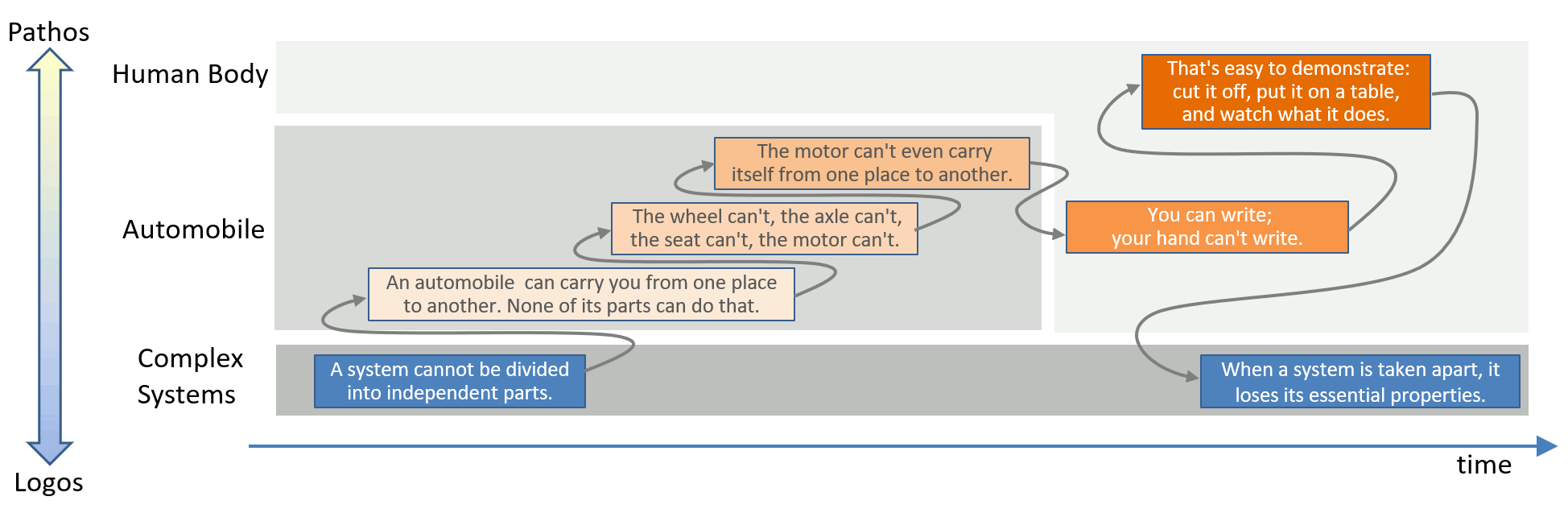
Like any good model, spacial arrangement has meaning in this visualization:
- time flows from left to right (GANTT Chart-like arrows flowing against time are allowed to keep the horizontal from stretching too far)
- the vertical axis represents the range from logos at the bottom (the baseline of content) to pathos on the top (more excitement and emotion)
As shown, Ackoff starts with logos: one of his key statements about systemic improvement of complex systems is that a system cannot be divided into independent parts. He quickly switches to the automobile example to ratchet up pathos, culminating in his cheeky comment that an engine can’t even transport itself.
He then backs off a bit to introduce a new example–the human body. There he turns the “pathos dial” to 10 by conjuring mental images of chopped off hands (the brave will instantly think of the movie Idle Hands, which imho deserves a much higher score than 6.2 on IMDB. Perhaps you want to check it out on Halloween). For Ackoff, the idle hand is actually the lead into the next piece of logos, another key statement about systemic improvements.
Now that we have successfully visualized the architecture of Ackoff’s speech, let’s do what architects routinely do: look for reusable patterns.
Presentation Patterns as Waveforms
When applying the notion of patterns to presentations we benefit from an intentional overloading of the term:
- We could refer to actual patterns of speech, e.g. the flow of energy or pathos over time.
- We could also refer to design patterns of crafting a presentation, much like Matt McCullough, Nate Schutta, and Neal Ford have done in their book Presentation Patterns (also on the O’Reilly Learning Platform).
For this post, we are looking for patterns of the first kind. This is an area I am still actively working on, and that, with a little luck, should result in a small book. However, I want to share a few early pattern prototypes to get feedback (their resemblance with asynchronous communication patterns is purely intentional):
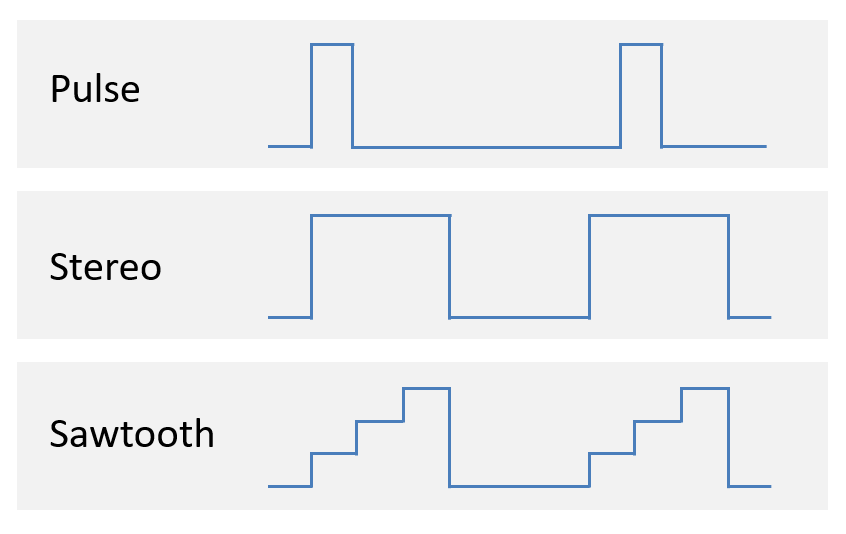
These Sparklines are like waveforms for your presentation. They work for both ethos and pathos on the vertical axis. In either case, logos is at the bottom as the foundation of what your are aiming to get across.
Let’s have a quick look a the three patterns depicted above:
Pulse
This pattern periodically injects a pulse of pathos but quickly returns to logos. Common usages are:
- Starting each new content section with a quote (“software eats the world”, “data is the new oil”, or perhaps something more novel or controversial)
- Concluding each content section with an anecdote, example (pathos), or customer reference (ethos)
As long as you don’t overstretch the logos sections, this is a simple pattern that goes a long way towards balancing out a technical presentation.
Stereo
With Stereo, you are running on two channels: logos and pathos (3 channels are also allowed). The most common usage is:
- A running example that you frequently come back to after each bite of logos
- A standing metaphor that allows you to translate the logos into a more widely known domain (I often use automotive metaphors as cars are one of the most widely used complex technical systems)
- Showing how what you explained could be applied to your audience’s situation (“what could be”)
Sawtooth
This pattern is closest to what Russ Ackoff did: you start with logos and gradually build up pathos until you hit 100%, just to reset to the next logos. This pattern is powerful and requires some finesse. It can be achieved by:
- Using two metaphors, one more technical and one closer to real life (more pathos). This is what Ackoff did.
- Using one metaphor but painting an increasingly vivid picture, culminating in chopped-off hands or something milder, depending on your and your audience’s taste
An Oscilloscope for Your Speech
There are surely many more useful waveform patterns. The objective here isn’t to follow any of them exactly. Rather, I want to encourage you to think about them like attaching an oscilloscope to your speech. The signal you’re tracing can be pathos, ethos, pace, volume, or any other characteristic of human speech. The one pattern you don’t want is a flatline.
If you find these posts useful, allow me to point you to my book The Software Architect Elevator, which dedicates eight chapters to technical communication.
Grow Your Impact as an Architect
The Software Architect Elevator helps architects and IT professionals to take their role to the next level. By sharing the real-life journey of a chief architect, it shows how to influence organizations at the intersection of business and technology. Buy it on Amazon US, Amazon UK, Amazon Europe