
Updated: Category: Architecture
My Architect Elevator workshops sharpen architects’ ability to convey complex technical topics to the upper levels of the organization. The approach isn’t based on merely adding more skills, but about combining skills to become a force multiplier. The same is true for your brain: the left (logical) side can multiply its impact by combining it with the right (creative) side.
IT Strategy: High-level with depth, fast and punchy
Because you can’t acquire communication skills by listening, the workshop includes many exercises. One of these exercises asks participants to define critical IT capabilities needed to support various business strategies. In line with the elevator concept, teams find that different sets of IT capabilities are required for different growth paths that the business considers.

Translating business growth initiatives into IT needs is a relevant part of any IT strategy to be shared with senior executives, making this exercise highly relevant. However, the interesting part isn’t just the outcome, but also the process that the teams follow to arrive at it. Most teams start out rather analytical by brainstorming capabilities and listing them out. Although they develop valuable content, the initial presentations tend to fall into the typical IT pattern of long lists of stuff. So, as most workshop exercises do, we make another round to refine the delivery of the content. But we’re not done there. We also synthesize all team’s work into one punchy storyline.
To not mistake this for a run-off-the-mill classroom exercise, I underline the value of the outcome as follows: imagine that you hire a top-shelf consulting firm like McKinsey, BCG, or Bain to conduct this analysis, including a gap analysis that maps the required capabilities against current ones. How much would this cost? Good answers range from $200k to $500k+, somewhat dependent on region, and on how many juniors the firm can pad the engagement with. That’s a serious chunk of money. But when you’re about to make an 8-digit strategic investment, it’s likely to be a wise investment. The amazing part–both in a good and a bad way–is that within 45 minutes teams can generate content that surpasses a lot of the executive presentations that I see.
The exercise is also a prime example of high-level work not being shallow. IT strategy doesn’t get a lot more high level than mapping the business’ primary growth strategy into technology. But as every participant easily attested, it’s far from shallow: you see groups of senior architects debate, structure, and iterate over their proposals. Occasionally smoke comes out from their brains…
Left for Logos, Right for Pathos
The exercise takes teams on quite a long journey, massively compressed in time: they must transform raw IT content (cloud, IT operations, application modularity) to engaging stories, memorable metaphors, and catchy visuals. This can only be done by using both sides of their brains. logos as the foundation comes from the left, logical side of our brain. The right side delivers pathos–emotions and engagement. Only by using both halves of our brains can we create compelling content that not only has a strong foundation, but is also approachable and engaging.
Multiplication
The combination of left ans right, Logos and Pathos, is potent like a force multiplier. However, as we will see in a moment, it’s not a simple two-step process, aka “we have good data, so lets weave a story around it”. That’s why being a great architect is the product of skills: you can’t just ask someone to pretty up your slides or put nicer words into your script after you have done your analysis. Instead you need to use both parts of your brain in rapid iteration. It’s more of an oscillation than a sequential process.
Zig-zag straight to the target
There is no 1-2-3 recipe for pulling this off, but having done the exercise many times yielded a useful set of steps that can help get you there. But you have to be willing to take some sharp turns and make some loops to engage both the left side of your brain (for logic and structure) and the right (for emphasis and storyline).
I am intentionally avoiding the word “process”, as that’d set unrealistic expectations, but I believe that you can break down the creative path into five distinct stages:
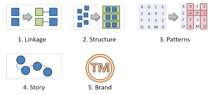
1. From Answers to Links
After the first round of the workshop exercise, virtually all teams’ answers pull from a familiar vocabulary of IT approaches: IT should migrate to the cloud, modularize applications, deploy a data platform or data mesh, enable new channels with headless eCommerce, or introduce standard APIs connected by common middleware. None of these concepts are really new, and that’s totally fine. We’re not trying to invent the next big thing in IT architecture (we’re all still digesting GenAI).
The risk of cooking the “IT Soup” with the same old ingredients is that an executive audience might not be be very excited: “so, it seems that serverless (and Kafka!) solve all our problems?” I know many engineers who would say “spot on, as long as it’s cloud native and loosely coupled!”
So, we need to do better than just spit out the usual IT vocabulary (not the soup!). Instead, each item in the proposed IT strategy must identify a business aspect that drives the need for it. This connection builds credibility with the executive audience that the IT team isn’t just listing all their favorite technologies (sadly, this happens a lot), but actually addresses the business problem
IT solutions draw on an established pool of technologies and approaches. The value-add is in the clear link to business needs.
Understanding the Business-IT linkage also allow executives to judge the ramifications of changes to scope or priorities. For example, if standard APIs are necessary to diversify the company’s product offering through acquisition, but the current IT capabilities are poor, executives must choose between investing into an integration platform plus upskilling, or pursuing an alternative business strategy, such as diversifying product lines that can be managed through the existing systems. These types of tensions are what engages executives.
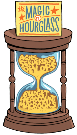
In Platform Strategy, I describe the lack of a clear link between business need and IT solution as the IT Hour glass. Its shape characterizes those common IT presentations that make broad and lofty promises, followed by a very thin thread of logic, just to finish with sweeping (and expensive) demands. It’s an all-too-common antipattern.
If you need a meme to remember to always link back to a need, remember K in Blade Runner 2049: interlinked.
2. From Lists to Structure
Whenever I see a list, of IT capabilities or otherwise, I ask about the order along which the elements are structured. If the answer is blank stares, it shows that the team brainstormed possible options but did not synthesize them into a structured form. They actually did not produce a list; they produced a set, which does not have an order. But to make it look nice on a slide, they show the set in form of a list–they made a laundry list. It’s difficult to make a credible storyline from a laundry list of stuff.
Lists have an order. Pick it consciously.
When you show a list, the audience will perceive an order, so if you don’t have one, you’re asking for confusion (lists also stir biases–if you have not read Thinking Fast and Slow, now is an excellent time to do so).
Two techniques break away from laundry lists:
-
Sorting
-
Grouping
Ordering can either come as a global order across all elements, or as a set of buckets into which elements are grouped. For extra bonus, the items in each group should also be ordered, but when it’s just a handful of elements it’s not as critical.
Structuring long lists is a common mnemonic technique that helps us remember things. For the popular baby shower game of having to remember as many items as possible from an ensemble, chunking is one of the best strategies. In your mind, you group all small items, or edible items, or all that have a certain color or shape. Instead of remembering 20 things, you now only have to remember 4 or 5 chunks of 4 or 5 items each.
What works for baby shower games also works in board rooms: you reduce the cognitive load on your audience, so they can focus on the subject matter rather than play a memory game. If you sort list elements by importance, it’s also easy to shorten the list: just drop the items at the bottom. Recall that 5 lukewarm arguments are weaker than 3 strong ones, so keep your lists short.
Laundry lists have become an even bigger liability in the age of GenAI: large language models love making lists. So, when you show a laundry list with many points that all sound kinda good but lack structure or a narrative, your audience may quickly assume that it was generated by AI.
Finding structure where there is none is an interesting left-right brain exercise: you need the ability to structure, but also need to be creative to see any form of structure emerge.
Default Structures
Finding a good structure in a litany of IT concepts is more art than science. My advice is to pick a simple one and see if it sticks. You don’t want to have to explain the structure itself, so simple and obvious win over elaborate. Two very common structures are surprisingly effective in presentations to senior executives:
-
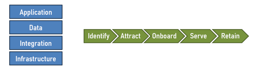
IT Stack: Every executive, whether from IT or not, knows that infrastructure sits at the bottom of it all, with databases and applications layered on top. Perhaps there’s anther layer for UI or APIs, or infrastructure may be broken down into network, storage, and compute. This basic IT stack works many times when you’re presenting IT architecture “in the large”.
-
Value Stream: Stories are sticky, and a special kind of story is the value stream where you show the user journey chronologically. For example, to grow your customer base, you need to identify customers, attract them, onboard them, serve them, and retain them. Sounds super logical? Yes, because it’s in the order of the value stream.
3. From Structure to Patterns
Structure helps rational decision making, but it rarely tells a compelling story. The story has to be laid onto the structure. Think of the structure as a map. Just looking at a map isn’t terribly exciting. Once you use it to discuss where you want to go, how to get there, or the awesome shortcut you found, then people get engaged.
But making our stories engaging isn’t enough: they must also link back at the data and structure. You’re not telling fairy tales, you are presenting architecture options and trade-offs. TED talks often overindex on the story: they are highly engaging, but they are not the material executives look for in a steering committee.
Once again, we need to engage the other half of our brain. To make the connection between structure and story, we look for patterns: what is interesting or noteworthy in the data? What stands out? What’s not there?
Use the right part of your brain, the creative side, to detect patterns.
Patterns can emerge in many forms or shapes. What patterns can look like is defined by the structure you have chosen. In a list, you may find order. In a matrix you may find straight lines, diagonals, or clusters. In a sequence you may find a progression, a causal relationship, or stages.
Look for things that remain the same across options or things that are different. Basically, you’re looking for variation. Are there areas of interest, boundaries, clusters, lines?
It’s best illustrated with a real example matrix from the workshop, which summarizes the output from the IT strategy exercise. The capabilities are organized as a simple IT stack, and each team is asked to indicate the two most critical IT capabilities by placing two dots in their column (indicating the business strategy that they worked off):
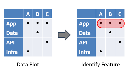
Each time I do the exercise, I get different data based on the teams’ judgments. So, we need to explore together and see what we have to work with. Interestingly, we have never failed to identify patterns and to craft a compelling storyline.
In this case, the first pattern is quite apparent: the top row is fully populated. This means that capabilities in the application layer are needed for all possible business strategies. This could be due to needed modularity or extensibility to support business expansion. The rest of the matrix looks a bit like a random plot.
4. Refine the structure to strengthen the patterns
As you’d expect, the transition from logos (structure) to pathos (patterns and story) doesn’t happen with the push of a button. The structure wasn’t chosen with the patterns in mind, for the simple reason that we didn’t know what patterns might emerge. Expect this to require some iterations, where you may go back and adjust the structure to help the patterns emerge.
I routinely change the structure to find patterns or to strengthen emerging ones.
Changing the structure does not mean changing the data–we can’t make stuff up! But it changes the way the data is represented and organized, so that nascent patterns become clear. Options A, B, and C don’t have to be in that order (they would not be called that in real life, anyhow):
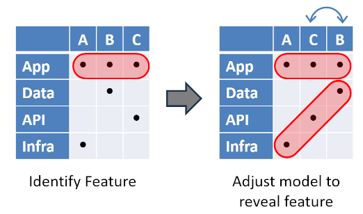
Reordering the columns helps an additional pattern emerge: swapping the columns for option B and C reveals a nice diagonal pattern. We now see a clear relationship between chosen business strategy and IT stack. There is no magic trick here–the data I use is different each time because it depends on the audience votes.
What is fair game for adjusting the structure when looking for a pattern? I don’t have an exhaustive catalog, but here are some techniques that I frequently rely on:
-
Reorder rows and columns: Reordering doesn’t change the data, so it’s a legit maneuver. Swapping rows may be awkward when you use an IT stack that has a strong implied order. However, swapping Data and API would likely be acceptable.
-
Merge: If two rows or columns show the same structure, why not merge them? Repeating the same thing isn’t adding much to the conversation. Perhaps you can even detect a superclass that aptly describes the newly formed grouping.
-
Split: If things aren’t looking interesting, perhaps you broad-brushed the topic. For example, you could split operations from infrastructure or software delivery from application. You now have a new dimension, which may highlight important differences or reveal new patterns.
-
Add: Perhaps your analysis takes an overly narrow view and you can get a deeper insight by adding new elements: broaden the scope to include ecosystem partners, add a time-axis (architects love to see more dimensions).
Domain-Driven Data Analysis
If adding, merging, or splitting entities to reveal new insights sounds like Domain-Driven Design, you are onto something. You are modeling the domain that spans across business and IT. That is a fascinating area and one that often gets too little attention. It’s sufficiently complex that you should use your best modeling skills: use consistent naming, put meaning behind names, highlight relationships, explore.
To me, this is the most exciting part of the exercise because we can’t predict what we will find, but if we put sufficient many lenses on the data, we are highly likely to discover some interesting patterns.
5. Craft a story
The pattern isn’t just a nice visual, it also the major stepping stone to a punchy story. In the matrix shown before, we can confidently declare that the choice of business strategy (A, B, or C) has an immediate impact on which layer of the IT stack that we need to focus on, ranging from application architecture to infrastructure: This is the Architect Elevator in action and an important message for executives.
6. Brand it!
A story engages your executive audience, but you want the story to live longer than just this one meeting. This means, the story has to stick.

Naming your visuals is very powerful to make them stick. Naming is great branding and it makes concepts memorable. You don’t want your picture or story to be “the slide with the hexagons”. Instead, my IT strategies include “the bone” aka “the dumbbell”, the “IT strategy triangle”, the “double pyramid”. This activity is clearly with the right half of your brain to pick a catchy and memorable name. Once you have one, use it without hesitation to establish a brand and shared understanding.
Full-brain activity for the win
Getting from business requirements to a convincing and memorable IT strategy often takes multiple quarters and multiple hundreds of thousands of dollars/Euros/Pounds. And more often than not, the results are mediocre. Following the creative steps outlined here, you can get to an anchor story or anchor image in less than one hour, as demonstrated in many workshops. It’s not magic, but sufficiently advanced approaches are indistinguishable from magic!
Grow Your Impact as an Architect
The Software Architect Elevator helps architects and IT professionals to take their role to the next level. By sharing the real-life journey of a chief architect, it shows how to influence organizations at the intersection of business and technology. Buy it on Amazon US, Amazon UK, Amazon Europe