Updated: Category: Architecture
This post is the 4th part of a mini-series titled “Think Like An Architect”. They don’t need to be read in order, but I encourage you to start with Part 1: Famous Architects Sketch
One of my more popular articles is titled Don’t get locked up into avoiding lock-in, hosted on Martin Fowler’s site (an edited version is also part of my book Cloud Strategy). The key premise of that article is that lock-in isn’t an absolute property but has many nuances. To set the stage, I decomposed the notion of lock-in into the following aspects: vendor lock-in, product lock-in, version lock-in, architecture lock-in, platform lock-in, skill lock-in, legal lock-in, and mental lock-in. You might think of additional ways in which one can be locked-in, but the result is clear: being locked in is not a binary, one-or-zero, black-or-white condition. There are many shades of gray. And seeing these shades is one way architects think and bring value.
Decision Continuum
Once you realize that things aren’t binary, your decision process changes. Rather than arguing between two opposing positions, you are now looking for the optimum on a spectrum of options. On one hand, this approach makes things more difficult: proclaiming “we must avoid lock-in” is much easier than actually considering which type of lock-in should be reduced up to which extent. But, seeing the option space as a continuum also allows for compromise and can help avoid the debate whether green or blue is the better color (or cylinder vs. circle for that matter).
Finding the Optimum
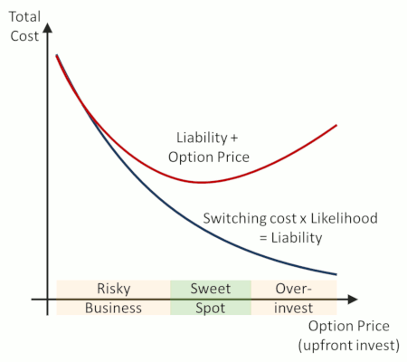
In my article on lock-in, the central figure for architectural decision making is the graph that shows total expected cost over the spectrum of lock-in. The architect’s job is to find the minimum cost, taking risk and effort into account.
The graph anchors this decision back to the notion of buying options: buying an option (in IT architecture as well as financial markets) allows you to defer a decision (such as allocating compute capacity or purchasing a stock). Deferring decisions has value because with more information you can make better decisions: deciding whether to add capacity or to purchase a stock is much easier when you have the actual capacity needs or (future) stock price at hand. The horizontal axis therefore contains a range of things that you can do to reduce lock-in, for example designing our application to be horizontally scalable or deploying it on a serverless platform like AWS Lambda. That’s how much you are paying (investing) into having the option:
 Architects minimze the total cost along a spectrum of choices
To find the optimum, you need to have a rational measure for lock-in, i.e the vertical axis. The main reason to avoid lock-in is that if you need to change to a different solution or add hardware, it will cost you unless you prepared for it. So, the best measure of lock-in is the expected switching cost, which is calculated by multiplying the likelihood that you need to switch by cost of making the switch. That’s the black curve in the graph - it goes down the more you invest in options.
The architect’s job now is to consider the total cost, which is the sum of the expected switching cost and the upfront invest (represented by the red curve). While the graph here is only an abstract example, in most cases you will find that an initial investment into reducing lock-in pays off as it can reduce potential risk for little cost. This is where using object-relational mapping tools like Hibernate or using languages like Java fit. After reaching a sweet spot, you are likely to reach the zone where you end up over-investing: building a complete abstraction layer that allows you to move to any imaginable run-time environment will increase complexity and up-front effort to cover a rather unlikely event. You might feel good that you covered all eventualities, but your job as architect isn’t to sell the “warm and fuzzy”, it’s to find the most economical solution given what you know.
Ends of a Spectrum
By converting the decision into a continuum of options and establishing a rational model, our architect moved the discussion from “lock-in = bad” to a nuanced decision model. And although the model is more qualitative than quantitative, it helps us observe that the endpoints along the decision spectrum are rarely optima. In our example, doing absolutely nothing (the left end of the spectrum) is equally unlikely to be the best option as building every imaginable scenario into the initial product design (the right end of the spectrum).
Our financial friends already know this from their business domain: reducing lock-in is like reducing the strike price of an option so you pay less when you use the option in the future. However, driving the strike price down increases the price of the option until it equates to purchasing the stock, which misses the whole point because now you paid already for a choice that you wanted to defer (go, ask someone who trades options).
You might observe that architectural decisions aren’t equations that can be solved with mathematical precision. Also, the range of options is likely to be discrete as opposed to a real continuum. This doesn’t mean that the model isn’t useful. Rather the opposite: a simplified decision model as the one shown above is likely to help you make much better decisions than following your gut or a simplistic view that “we should minimize lock-in”. That’s why it’s so useful to see shades of gray.
Analog Circuit
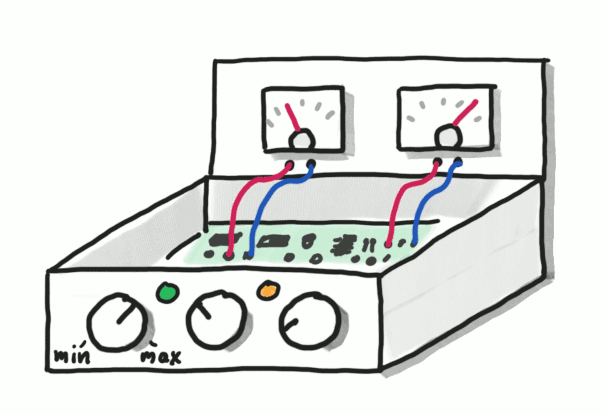
Knowing that architects like to peek inside the box to understand causality, stretching the circuit metaphor from Part 3 a little bit, we conclude that the causality models that architects use are analog circuits, not digital ones. Architects’ minds see a box with several (analog) dials that influence the desired output, such as cost or scalability. Architects reason about the circuit inside the box so that they can do better than trial and error or relying on simplistic approaches.
 Architects turn the dials to find the optimum
Granularity
As hinted above, the shades of gray that architects deal with aren’t completely continuous. For example, when you have to make a product selection, it is pretty much black or white: you either pick product A or product B, unless you pick both, but why would you want to do that? But soon come to realize that the problems actually breaks down into several smaller problems, again giving you a range of choices. My favorite example is the arduous process of defining a single integration standard in a large enterprise:
After seemingly endless debate and political maneuvering, we realized that the whole endeavor made little sense. We clearly needed at least three kinds of integration: back-end and legacy integration that connects with as many COTS systems as possible, a message bus that integrates our own applications, and an external API gateway to control external access to our systems.
So, we really needed to make 3 decisions and hence consider 8 shades of gray! The story also highlights how meaningless setting standards is without an architecture in place, one of the key points I make in The Software Architect Elevator.
Visualizing the additional choices reminds me of dithering - simulating shades of gray with black and white pixels.
![]() If eBoy did your enterprise architecture
If eBoy did your enterprise architecture
Maybe a complex system landscape looks like Pixel Art if just seen from far enough away. It’d certainly make enterprise architecture more entertaining!
Next up: Part 5: Architects Zoom In and Out, See Different Things


