Updated: Category: Architecture
This post is the start of a mini-series titled “Think Like An Architect”. There’s so much debate on what makes a person an architect (aside from their business card), that I’d like to share my view on how modern architects think and work.
When thinking of IT architects, the first picture that comes to many people’s mind are diagrams. Architects produce pictures, often whole slide decks full of architecture roadmaps, functional decompositions, deployment diagrams, reference architectures, architecture patterns, and the occasional GANTT chart. A quick image search on “IT architecture diagram” yields a fairly representative sample:
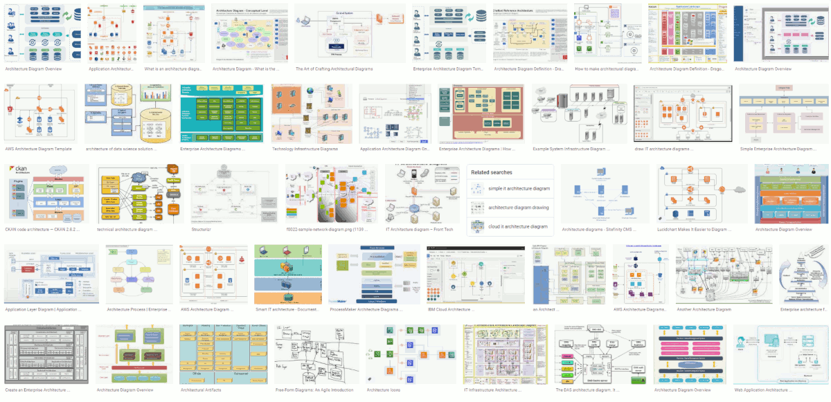
Yup, that’s the architect “artwork” we know.
Architecture Sketches
The diagrams created in IT resemble engineering blueprints - structural models that help build systems. And although these diagrams match the common definition of software architecture - a system’s components and their relationships - when we look at the sketchbooks of famous (building) architects, we are likely to see a different kind of drawing.
For example, Frank O. Gehry’s initial sketch of the much hailed Guggenheim Museum in Bilbao, Spain looked like this (a good collection of his sketches can be found on arcspace):
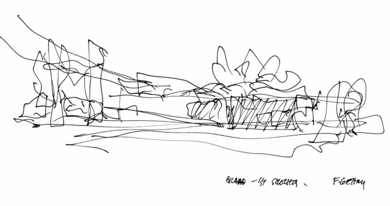
Now, that looks quite different from the diagrams we saw above. This architecture sketch shows the abstract gestalt of the building, emphasizing the essence and leaving out a lot of detail.
Naturally, an army of engineers and draftsmen would translate these sketches into engineering drawings, floor plans, electrical wiring diagrams, and so on that will be used by the builders. But the inevitable star of the show, the architect, does the sketching. And even if it’s on a cocktail napkin, he or she gets more recognition than the folks spending days and nights detailing out engineering drawings, performing statics calculations, and compiling bills of material.
Therefore, as an IT architect you should be cautious if you find yourself spending most of your time listing products to be included in bills of material. That’s also a useful activity, but I don’t think it captures the essence of what architecture is about and is unlikely to have you regarded as a great architect.
Less is More Difficult
Borrowing more from the (often ill-advised) building architecture analogy, we often stumble upon the famous slogan that “less is more”, commonly attributed to Ludwig Mies van der Rohe who brought us such gems as the German Pavilion in Barcelona. Now, the slogan surely wouldn’t be quite as well-known if “less” meant just doing not as much (try that with your boss some day…). Rather, “less” means eliminating the noise to focus on the essence.
The Bilbao Museum’s essence is a sweeping horizontal layout, inspired by the location on the water front, anchored in a set of curvy towers on the right as you can see from the end result:
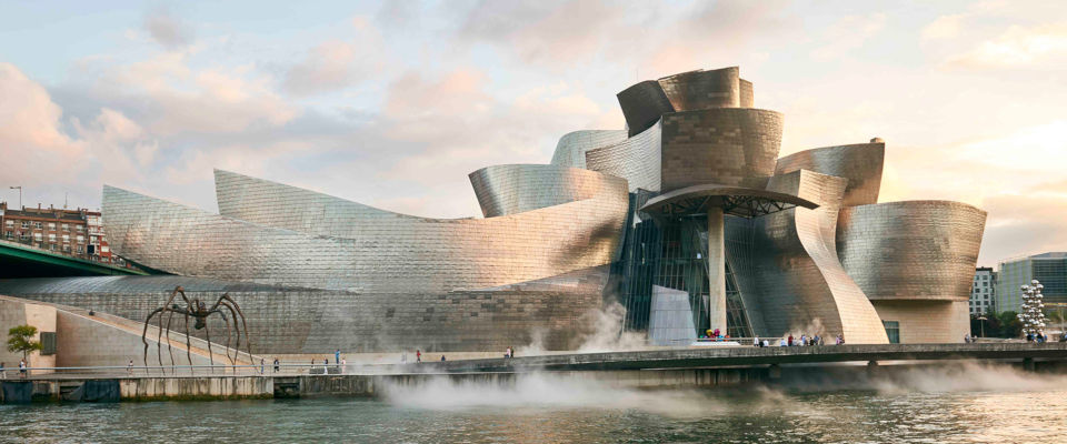
To eliminate the noise, you need to know what constitutes the essence. And that’s not much different from the ability to abstract - which turns out to be one of the major skills that architects should possess!
Omitting noise and focusing on the essence requires abstraction - one of the major skills architects should possess!
Now, it’s not enough to redraw the engineering drawings with squiggly lines and crooked fonts. That’s not an abstraction but just a different representation. Loosening up the rendering can help convey the state of finality of a design - a sketch indicates that this is still work in progress. However, that’s different from abstraction.
An Illusion Isn’t Abstraction
Of course, the abstraction only holds if it reasonably connects to reality. A quick check for the Guggenheim Museum confirms that the essence made it into the implementation (the squiggles on the right were perhaps subjected to the constraints of materials and gravity):
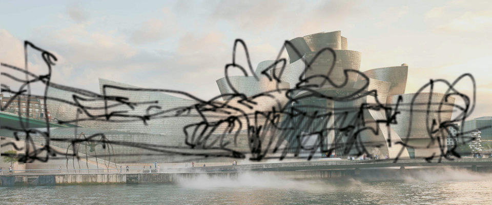
So, while you architecture sketch can omit a lot of detail, it can’t just be the architect’s dream that is detached from the implementation (I wrote about the Architect’s Dream or the Developer’s Nightmare back in 2007).
Architecture Lives in Context
Another critical aspect that comes to light in these architecture sketches is the context in which the architecture is placed. It takes some imagination, but in the sketch a bridge and another tower are placed to the left of the main building. Also, the sweeping horizontal layout accentuates the location by the waterfront. A tall tower would have looked out of place here.
The same holds for IT architecture. Architecture isn’t good or bad but suitable or unsuitable for the context and the purpose. And just like building architecture, it’s often guided by non-requirements, those that aren’t explicitly stated (perhaps it’s worth detailing this aspect in a subsequent post). Also, just like the building architect, the IT architect will be in constant dialog with the project owner to find a solution that has architectural integrity but also reflects the project owner’s preferences.
IT Sketches
So, what does a good IT sketch look like? My books contain sketches rather than engineering design diagrams, so you’ll find a lot of examples there. Here’s one from my recent book Cloud Strategy.
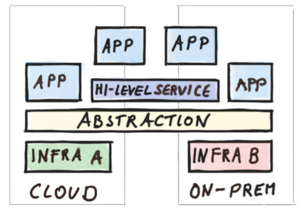
Even without the sketch’s context, you can quickly see that the “Abstraction” in the middle plays an important role: above it everything has a similar color whereas underneath there’s green and red. So, this layer makes the green and red blocks appear similar to the applications above. Inspecting the labels underneath, green represents the cloud infrastructure and red an on-premises infrastructure. So, this sketch shares one approach to achieving hybrid cloud by pulling a common abstraction like Kubernetes over the respective environments. Despite millions of marketing dollars being in vested in these types of solutions it’s unlikely that you will see such a sketch that captures the essence of the approach, especially in contrast to other approaches as the book’s chapter on hybrid cloud architecture does. That’s the power of good sketches.
Note: Funnily, this sketch violates one of my rules for architecture diagrams because it doesn’t contain any lines. No one is perfect!
Supply and Demand
Is it fair that the people who produce sketches on napkins are paid higher than those doing painstaking engineering work? In the end it’s a matter of supply and demand. Detailing out designs according to relatively well-known parameters is something a large set of people can do. Taking a blank canvas and charting out a design that takes into account the context, technical capabilities, and the customer’s core requirements is significantly harder. People doing the former run the risk of being replaced by tools, whereas the scarcity and importance of the latter drives up the demand and the price.
Go, get a napkin - it’s good to be architect!
