Updated: Category: Architecture
This post is the 5th part of a mini-series titled “Think Like An Architect”. They don’t need to be read in order but I encourage you to start with Part 1: Famous Architects Sketch. If you enjoy these posts, you’re likely going to enjoy my latest book.
Architects deal with enormous complexity, routinely making decisions that balance many variables and trade-offs. Models are the best way to tackle that complexity. However, architects need to define the right level of abstraction at which to position their reasoning. For that, they need to be able to zoom in and out of complex systems.
Zooming Out Gives Context
Architects are the folks that deal with the non-requirements, the stuff that is needed but not explicitly stated anywhere. Often, these non-requirements stem from context (see Part 3 - Architects Look For Causality). To understand context and uncover non-requirements architects routinely zoom out to a broader context and back in to the details of the proposed solution.
You could say that zooming in and out is the essence of riding the Architect Elevator from the penthouse to the engine room and back.
Semantic Zooming
The way architects zoom isn’t like the mechanical zoom of a camera lens. Rather, they zoom more like a map - a map at scale 1:500,000 shows different things than a map at scale 1:5,000. Simply reducing the scale by a factor of 100 wouldn’t be very useful - roads wouldn’t be visible anymore because they are too narrow, for example. Or, if you choose to show roads, you’ll have a giant hairball.
For example here’s a tourist map of San Francisco:
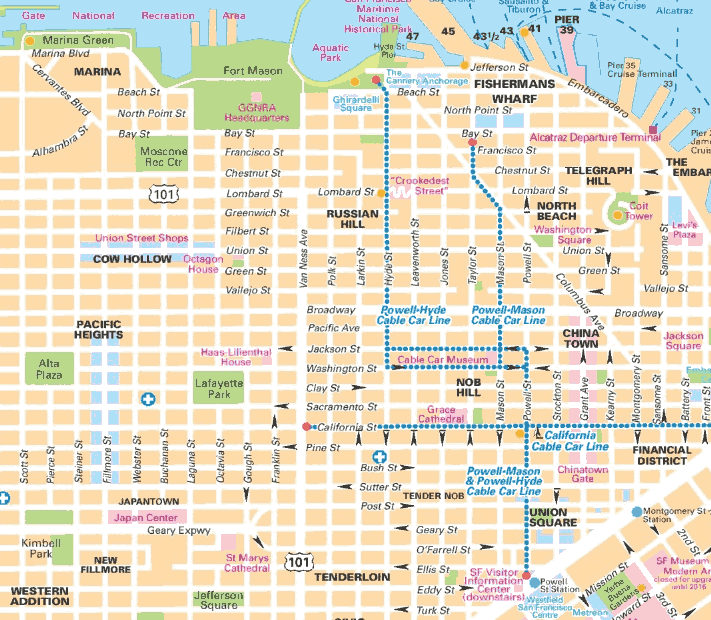
On my screen the map is about 15 cm wide, so we are talking about a scale of roughly 1:20,000. For those stuck in ancient systems of measurement, this means 1 inch on the map represents about 25.4 mm * 20,000 / 1,608,000 mm/mile ≈ 1/3 mile (the fact that the world has not managed to standardize on a logical system of measurement should give any enterprise architect significant doubt). Such maps show street names, local transit, shopping areas (light blue), and neighborhood names.
A map thats zoomed out roughly by a factor of 10 (the area represented by the previous map is now about 1.5 cm), might look like this:
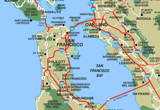
As you’d expect this map focuses on highways and major thoroughfares, which have been famously absent in San Francisco since the 1989 earthquake (Highway 101 now turns into Van Ness Avenue and then Lombard Street, decorated by about 30 traffic lights). This would be a useful piece of context for any architect who can predict a throughput problem quite easily. The map still shows universities and major points of interest (“interest” is a debatable term for Fisherman’s Wharf, however).
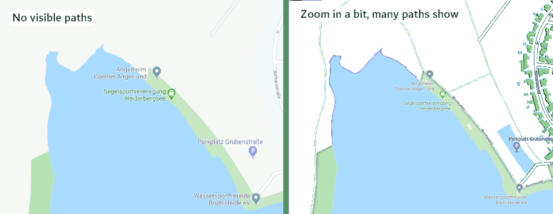
The natural question now is how you get from Map A to Map B or vice versa. I am reminded by the fact that this isn’t an easy problem to solve every time I go on a bike ride near my home town in Germany to find that Google Maps considers bike paths or forest routes as too insignificant to show at any zoom level that’s suitable for navigation (showing paths in light-medium gray on a medium-light gray background puts the final nail in the coffin for using Maps for bike riding - in the picture I cranked up the contrast to even make the paths visible at all):
Zooming IT Architectures
So how do IT architects zoom in a meaningful way? They also deal with complex landscapes where they both need to zoom out to navigate and zoom in to understand detailed relationships. There are two aspects to this:
- Changing (or adjusting) the underlying model
- Changing the model’s visual representation
Allow me to start with #2 because it’s a bit easier to visualize.
Zooming Visual Representations
Let’s say you have a complex picture with many parts: applications, servers, capabilities, database tables - the stuff architects deal with. Assume there are too many pieces to fit on a reasonably sized page and still be readable. One option you have is what I call the “tapestry” - a wall-sized print out that’s more impressive than useful. The other option is to zoom out and re-arrange the visuals so that they can fit on a regular sheet of paper or display - see the chapter “Emphasis over Completeness” in my book The Software Architect Elevator.
But just like with Google Maps, such a translation isn’t trivial. Here are some common techniques that help make zooming out meaningful:
CONTAINMENT
If one element contains other elements, when zooming out you could just show the containing element instead of all the pieces. For example, if you have a set of capabilities listed for each application, when zooming out you would only show applications. If you zoom out further perhaps you would show only application groups.
To pick a real example, I am going to lean on my friends Mark Richards and Neal Ford’s excellent book The Fundamentals of Software Architecture. Btw, if you read their book, you’ll find that The Software Architect Elevator makes a perfect follow-up.
Mark and Neal just posted all their images on their site, so I will convene myself to one of those. Not resisting my bias for messaging solutions, I pick the following architecture diagram of an event-based ordering system:
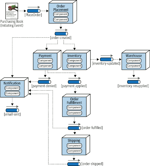
That’s a decent architecture picture that shows how an order leads to payment and shipment. There’s also quite a bit going on. Imagine you have another 10 or 20 elements and it’d get messy pretty fast.
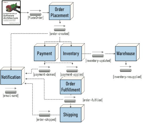
As a first step, we conclude that showing components inside event processors isn’t really needed. Interestingly, in the original book example, each processor showed four contained components, so Mark and Neal seem to agree. The result is visually a little less noisy but looks essentially the same:
ATTRIBUTES
Another simple technique for zooming out is to omit detail to generate more space and reduce clutter. For example, you could use abbreviations instead of spelled out names or no longer show attributes.
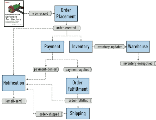
In our example, despite me cherishing the Message Channel icon (I think I know the source), we can replace them with simple pipes given that all channels are Publish-subscribe Channels. Also, dropping the 3D effect also seems natural - it likely indicates a event processor, but since all remaining boxes are event processors, a simple rectangle will do. The result looks a bit cleaner- you can imagine this being easier to zoom out:
Other examples for removing attributes would be cardinalities in database schema diagrams or directional arrows on dependencies. When zooming out, color is a convenient way to indicate attributes because it scales down well compared to visual decorations.
RELEVANCE
Even after showing only the outer, i.e. containing, parts and reducing attributes there’s still be too much going on to make an intuitive picture of 20 or 30 of these elements. The question then is whether you can omit some elements because they are less important than others.
In our example we realize that almost half the arrows are for notifications. By making those less pronounced, we simplify the picture without losing meaning. In a Publish-subscribe architecture adding notifications is simple, so it’s less likely that this aspect is the most critical one we need to convey. I chose to indicate notifications being sent by introducing a new visual attribute - a risky maneuver but I think it works in this context.
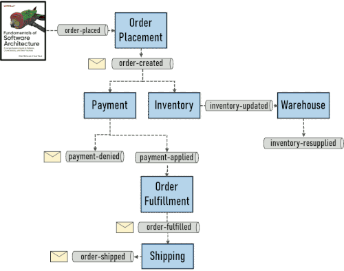
This technique is a bit more nuanced because it relies on a judgment of what’s “important”. Importance really takes a backseat to relevance - whether something is relevant depends on what question you’re trying to answer. So, a component may be relevant to one discussion but not another. Many enterprise architecture tools struggle in this aspect. There’s also human judgment at work. Your diagram may look different from mine.
CLUSTERING
Some elements might not be contained by an outer element but are nevertheless interdependent, meaning there are a lot of connections or dependencies between them but fewer from the outside. When zooming out, you could therefore replace these elements with a a single element depicting the cluster. Essentially you are introducing logical containment based on cohesion.
In the order management example, inventory management could be considered its own world and outside of the immediate order fulfillment flow. We can therefore turn it into a single object.
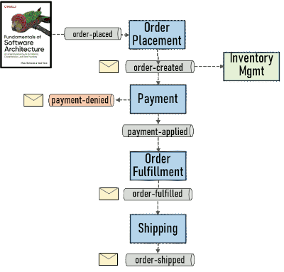
We also used coloring to indicate components that belong together - it’s a great way to show grouping without using up real estate. Similarly, we indicated that a red message channel is one that conveys exceptions.
PATTERNS
A special form of clustering is to find recurring patterns that combine multiple elements into a single meaningful one that expresses more than just a cluster of things.
In our example, a nice linear flow emerged, with exceptions and connections to other systems branching off to the side. A linear sequence of tasks is a recurring pattern in message-oriented systems, making up the essence of the Pipes-and-Filters Architecture Style. You can therefore abstract the middle part of the architecture into a single element expressing a linear flow with 3 steps:
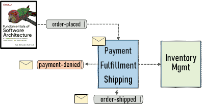
This abstraction is slightly lossy because it’s no longer clear which of the 3 steps sends the error message or communicates with the inventory management subsystem. However, if you look at the “big picture” you might be more interested in overall dependencies than that specific detail. That’s where architectural judgment comes in. Patterns remain more expressive than simple clustering because the pattern can express how the elements on the inside relate to each other. In our case, it’s still visible that there are 3 steps executed in sequence.
Meaningful zooming out requires judgment.
We now “zoomed out” the diagram from 7 elements to 2 (not counting the book) and reduced the number of message channels shown from 9 to 3, admittedly without losing much of the essence that we are trying to convey as architects. It would be amazing if you had a tool that could do this kind of semantic zooming in an out as you literally hold the control key and roll the mouse wheel up and down (I am sure the magic mouse has a similar totally non-obvious gesture that’s obvious to all those who were told about it).
An interesting metric I haven’t thought of before is to measure the complexity of your drawing by the .png file size. In this example, the drawings shrunk from 18 kB to 9 kB, not bad considering the text barely changed. That metric isn’t as ridiculous as it might appear because PNG file size is less dependent on image dimensions but more on visual noise.
The following table summarizes the zooming techniques we used:
| Technique | Description | Example |
|---|---|---|
| CONTAINMENT | Show only outer elements | Removing “components” |
| ATTRIBUTES | Remove detailed properties | Don’t show type of message channel, remove 3D effect for processors |
| RELEVANCE | omit parts that are less relevant | Don’t show channels to notification service, use a simple icon instead |
| CLUSTERING | Combine parts even if there isn’t a strict containment relationship | Group elements into “Inventory Management” |
| PATTERNS | Combine parts based on common structures | Group 3 elements into a sequence |
Zooming the Model
The visual tricks above help us make better zoomed-out diagrams, but those diagrams are only useful if they help us answer questions or make better decisions. Besides just trying to get more things on a sheet of paper, most architecture models also have a hierarchy of elements that they perceive as “top” and “bottom”. Traditional EA (Enterprise Architecture) models connect layers similar to the following:
| Layer | Example |
|---|---|
| Business Domain | Finance, HR, Manufacturing |
| Functional Area | Forecasting, Payroll, Inventory Management |
| Application / Information System | ERP system, Employee Portal, CRM System |
| Capability | Risk calculation, payment, reporting |
| Infrastructure | Server, storage, network |
You’re likely find additional items like APIs, Databases, that are also meaningful in an enterprise architecture context. The base idea is that you can zoom out to see the major business domains of your enterprise and then zoom in to see what hardware is allocated to each domain or functional area. Some associations will represent “containment” relationships (e.g. one business domain contains multiple functional areas), whereas others may be more complex many-to-many relationships (one server can run multiple applications which in turn are spread across multiple servers). Then you have things like shared services and platforms that contribute to many other elements. My experience is that although these base models bake into the tools make good sense, mapping them to meaningful projections for decision making is much harder.
So, such EA models and tools can help the architect zoom in and out but they certainly don’t replace the architect’s ability to decide what’s relevant at different zoom levels. And much of that depends on context (see Part 3: Architects Look for Causality).
Seeing Different Things at Different Layers
When you zoom in and out of a complex system landscape, you might feel like you’re zooming in and out of the Mandelbrot Set, the infinitely deep visualization of the divergence behavior of a sequence of functions over complex numbers. The closer you look, the more new complexity reveals.
The architect’s job is to discover meaning and patterns in that complexity and convey it to other constituents.
The following animation from Wikipedia gives a nice view of what that can look like:

If only architecture could be this beautiful. I actually think it is, we just haven’t seen it yet.


